
Graphs
Graphs are now available in Le Baby to provide a better journal overview. Just like the rest of the app, we designed them to be clear, without being a source of stress for newborn parents.

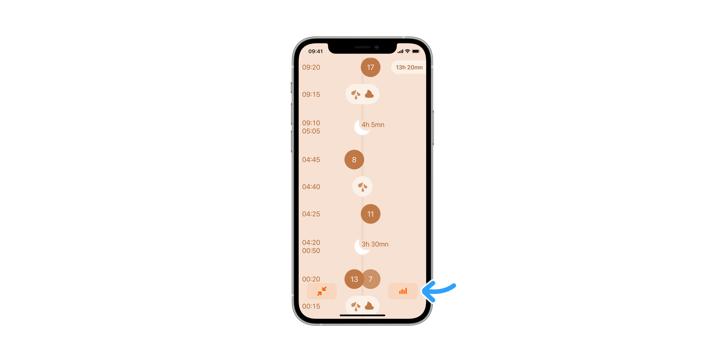
A swipe and a tap
Start browsing the journal by swiping it up: the “graphs” button will appear in the bottom right corner.
At first launch, the weight curve is displayed, while for subsequent ones the last viewed graph (bottle, breastfeeding, sleep, etc) will be shown.
It may look a little empty if you just started logging, but your baby’s evolution will start showing up soon enough.
Once you’ll have weeks worth of entries, you’ll be able to switch between daily and weekly views with the selector on the bottom right of the screen. In the weekly view, the value displayed is a daily average for the selected week, which range is comparable to the daily view values.
To get back to where you were in the journal before displaying graphs, tap the arrow in the bottom left corner.
Time travel
When accessing the graph from the journal, the curve reading will be set on the day or week you were viewing in the journal. Swiping left or right lets you go back or forward in time.
Tapping the date above the curve will take you back in the journal, at this precise date. This allows you to go from the overview to the entries details and back, without losing track of the time. This is especially helpful and comfortable when you’re curious about your baby’s habits, we hope you’ll appreciate.
About precision
Our intent while designing these graphs was to offer a more graspable view on trends, without falling into the trap of being too precise for the sake of it. Scientific precision should be left to doctors when necessary; they’ve been trained to handle it wisely. A baby’s behaviour remains the best dashboard for curious parents. More mysterious than a curve at first, but much richer in informations, emotions, and insight soon enough.
For users versed into data manipulation, and for whom these representations would fall short, we provided a way to get all collected entries in csv. Head to the settings screens, export the journal, and do your magic.
Comments
We have received a lot of requests to add these graphs in the app since we launched, and we’re happy we can offer them today. They’re not done, and will be improved over time. Please don’t hesitate to send us feedback from the parenting field, so we can make them better in future releases.